Whether setting up your brand new Kontainer or giving it a facelift, this guide is for you.
We keep adding to the system's customization features so you can deliver the best user experience, making Kontainer a coherent part of your brand's online presence.
Even for the hardcore Kontainer superuser, this guide most likely has something to offer, and you can always skip head.
Watch the video above or go through the written guide below.
Expanded Guides
Make Custom Landing Pages | Add a Brand Section | A Guide to Download Templates
Inspiration Links
Page Editor Design Suggestions | Brand Guide | Press Release
Share Your Designs
You are the experts, and we would love to share your designs as inspiration for other customers. Catch us at support@kontainer.com if we can share your creations or if you'd like some consultation.
GUIDE TO KONTAINER STYLING
Let's go through all your current options starting with your login page.
GENERAL LOOK & FEEL
Adapting your Kontainer's look and feel to match your visual identity is straightforward. The goal here is to make your Image Bank, DAM, Brand Portal or whichever name you know it by feel like a seamless extension of your brand.
As we keep adding to the system, this guide might change. If you are missing anything, let us know!
Login Background Image
The most salient component on your login page is the large background image that immediately impresses the user. This is a great place to present a strong brand, collection, or season asset.
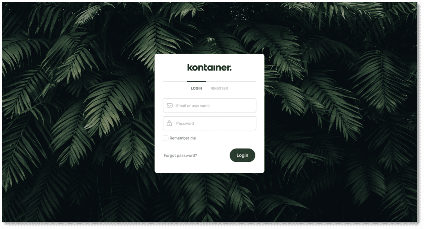
Your background image specs:
- JPG or PNG
- Max size is 3000x2000px
You change the image under Settings – Appearance (General)
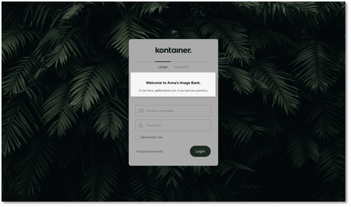
Welcome or login message
You can also add a welcome message or an important user notice on your login page.
To add or edit the text go to Settings – Configuration (General)
Example:
Your Company Logo
The second thing you will want to add is your company logo. This is also added under Settings – Appearance (General).
The logo will be shown on your login screen, at the top left menu bar inside Kontainer and on any emails sent from the system.
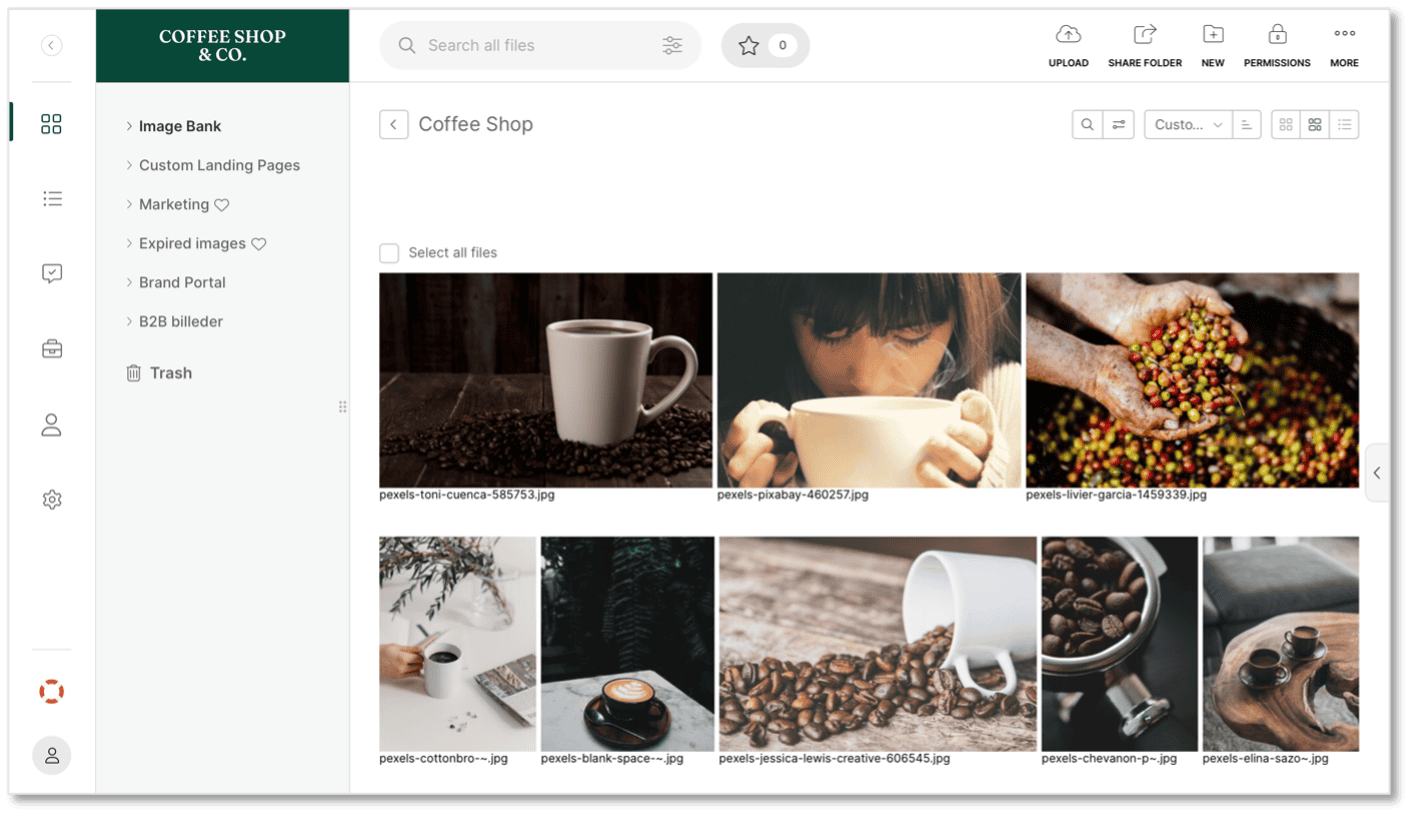
You can select:
- Logo placement
- Size
- Background color (use, e.g., with white logo)
The logo should be uploaded as an SVG file to cover all uses mentioned above.
Color Settings
We recommend editing the color settings to match your brand. Go to Settings – Appearance (General) to change:
- Highlight color – for selecting files, indication menu selection
- Primary background color – used anywhere but in the left menu
- Menu background color
- Button color
- Link color
Remember to Save your changes.

Favicon
Add your favicon under Settings – Appearance (General). The ICO format of your logo can be created here.

Browser Title
Along with the favicon, you'll want to customize your browser title. Go to Settings – Configuration.
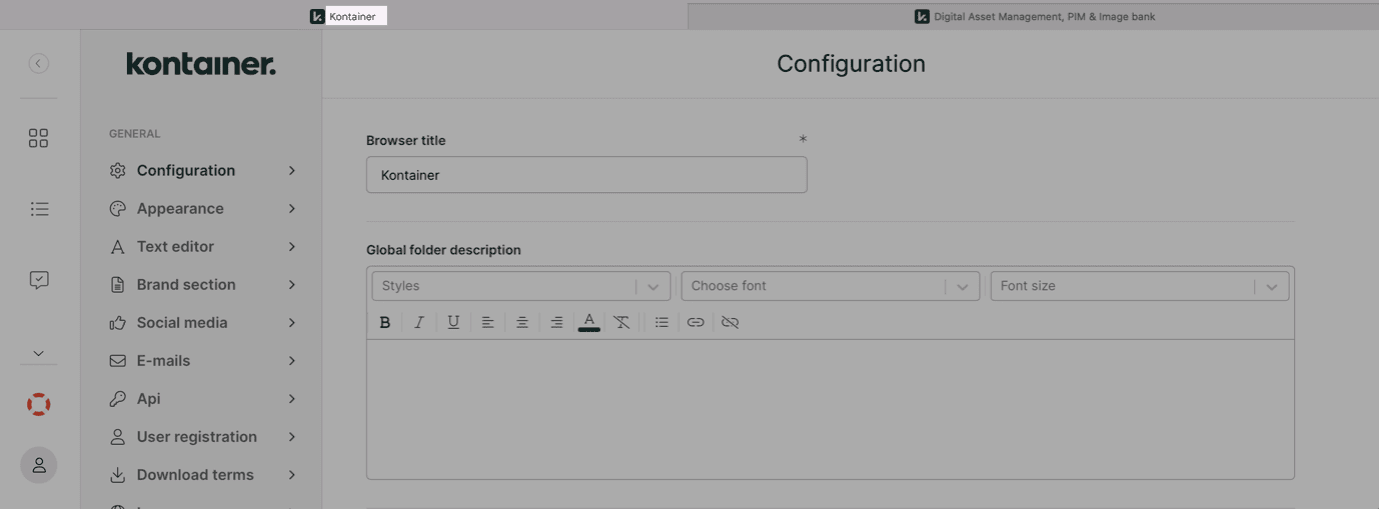
We recommend making it apparent to your users that they have landed in your Image Bank, Brand Platform, DAM or PIM – depending on how you refer to it.
Example: Asset Bank | Sara's Bike Shed
Global Folder Description
You can make a global folder description under the browser title in Configuration.
NOTE: This text will be visible in all your folders.
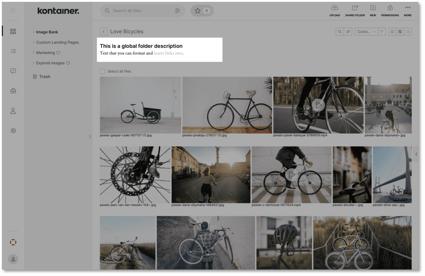
This could be relevant if you have a generic copyright message that should be visible in all folders.
Sorting Order
The presentation order of your files and folders can be setup up differently depending on your needs.
Go to Settings – Configuration and select either:
- Name (Alphabetical)
- Size
- Uploaded
- Custom
Custom is the only setting that will let you manually rearrange the order of folders or files.
If you use any of the other options, you can manually select another option within an individual folder, but that changes the order in your view. Your other users will still default back to the general setting.
File View
The way you view your files is a global setting that you find under Settings – Configuration. You have three options:
-
- Box = equal-sized preview boxes
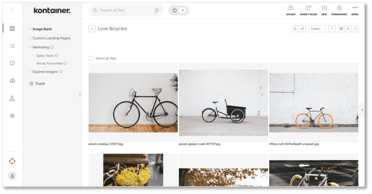
- List = standard list view
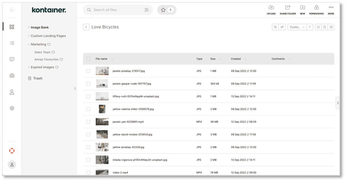
- Grid = preview adjust to image/asset specs
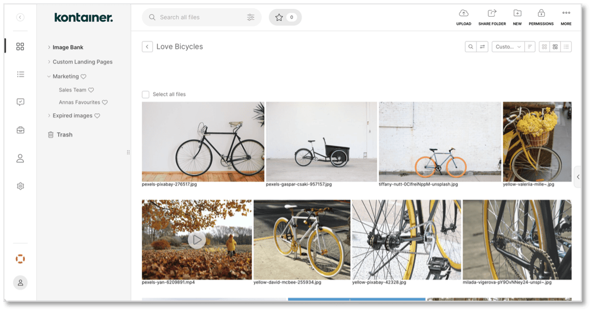
These settings can be changed in the folder, but the changes would only be made locally in your view.
FOLDER STYLING
In this section, we will cover the styling of your folders. There are many ways to style your folders; here are some examples:
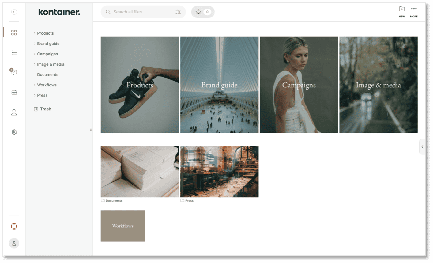
All folder styling settings are found under Settings – Appearance (Folder). Use the folder example to visualize your selections.
Once set, these presets will subsequently apply to all the folders you create.
Manual Styling
Folder-style settings will be used as the standard format when new folders are created.
But if you edit the folder style manually, these changes will be visible to all users. So, you can have these style presets that will be overwritten as you see fit.
Default Color Settings
These should all make sense without much explanation: Folder color, Folder icon color and File icon color.
The last color setting is Folder color overlay.


This setting will add a color mask on top of any folders with images on them. The feature is helpful to make sure you can read the folder names if these are written across the folders.
Default Folder Style
Select a standard folder size and potentially a default folder image. Folder cover images are easily changed manually by right-clicking on a folder and selecting Upload folder image. Or you can right-click one of the images inside the folder and select Set as folder image.
The size of the image can be as follow:
350 x 430 px
350 x 230 px
170 x 120 px
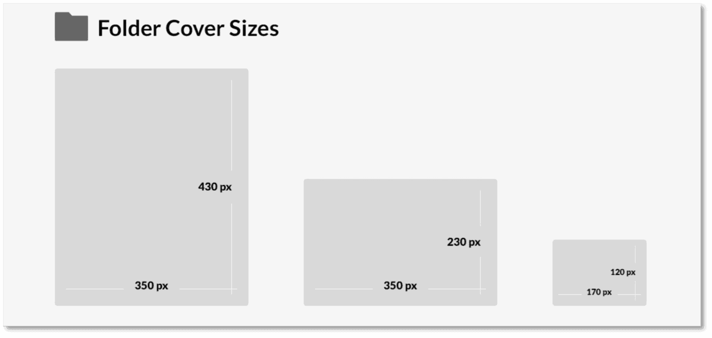
Your folders can have either rounded or sharp corners, and you can choose to display small folder names below the folder or large folder names across the folders.
Select sharp or rounded edges on the visual assets you add to your designs in the folder settings under Settings – Appearance (Folder).
Text Overlay
If the folder title should display across the folder, there are a few further selections to make. Set the text color, font and size. We currently support Google Fonts, which we can add at your request.
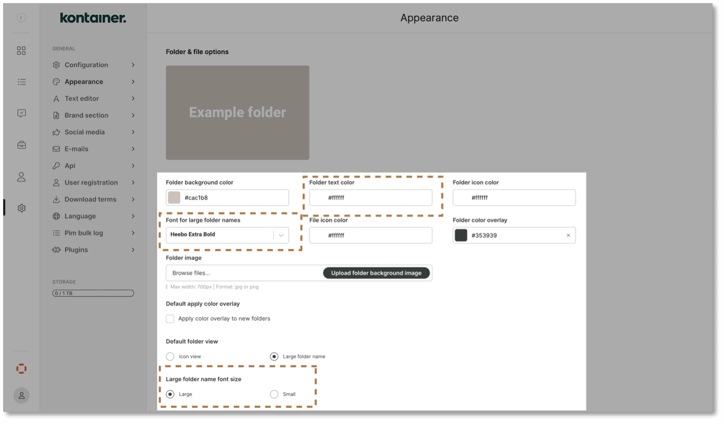
The above concerns the display of folders before they are selected.
In the next section, we look at how you can make landing pages inside your folders.
PAGE EDITOR
Try the Page Editor feature to improve the user experience and transform your folder into a landing page. You can add the following:
- Text
- Images
- Gif's
- Videos
You can set internal links to folders and external links. See the full Page Editor video here.
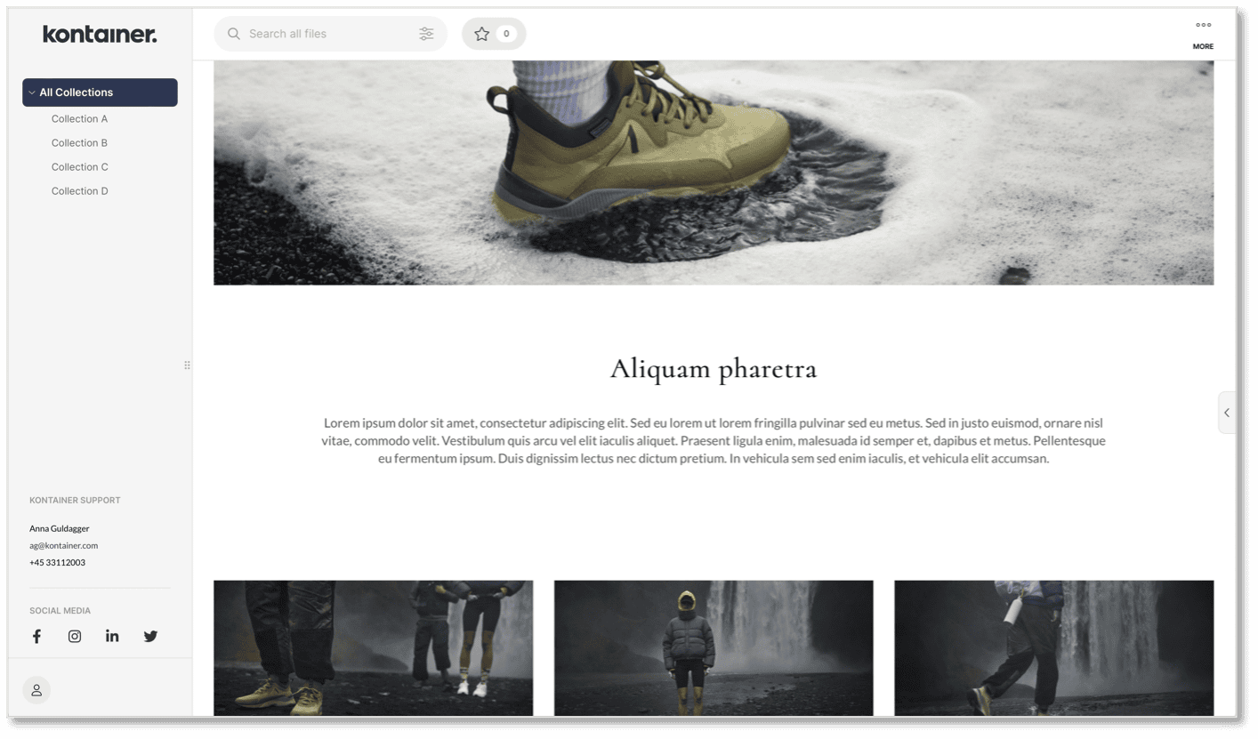
Brand Presets
Before you add text and designs to your folders, we recommend that you predefine some text styles. These make it quick and easy to format text when designing new pages.
Go to Settings, Appearance and Brand Presets to add your presets for text and colours.
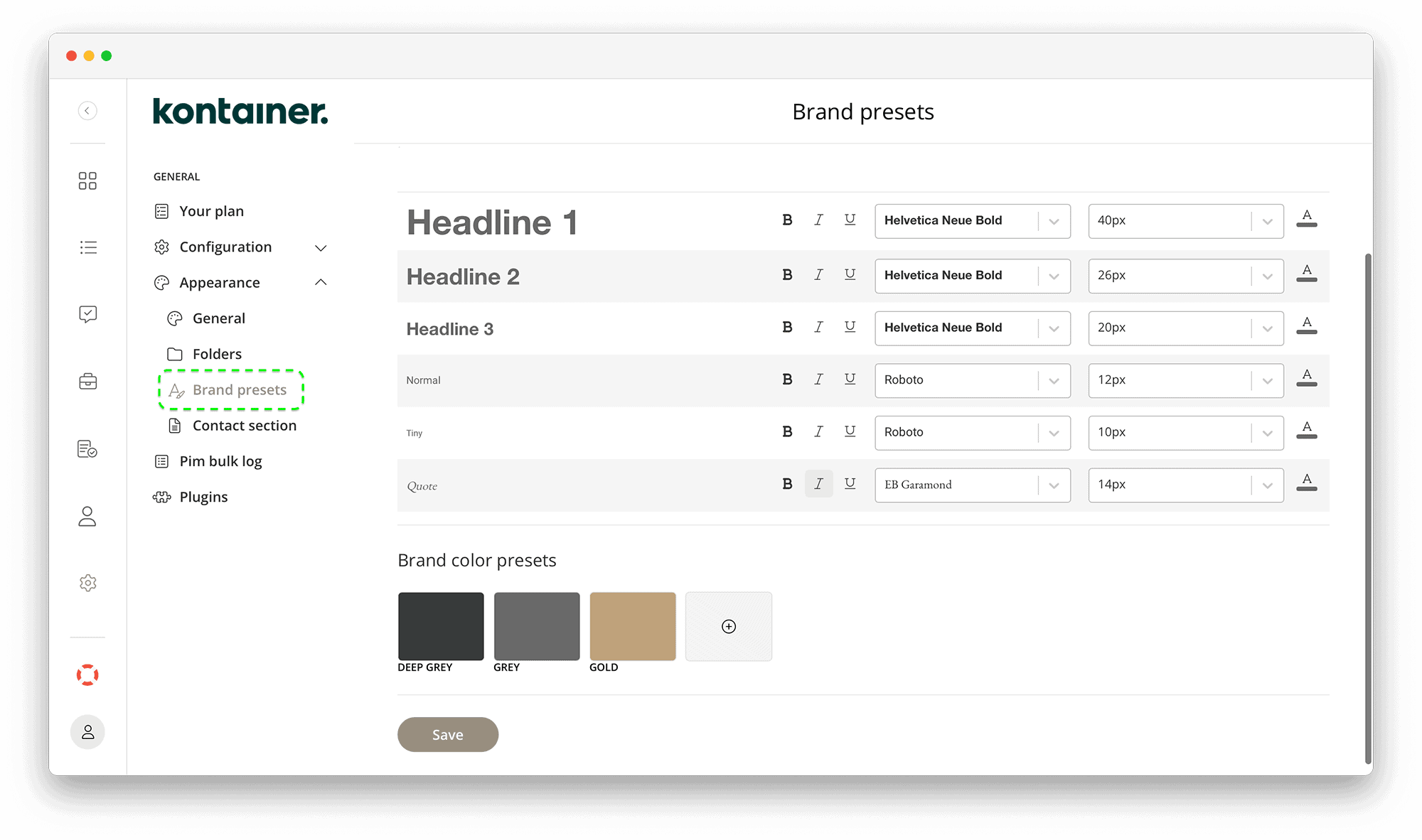
And they will be ready to use in the Page Editor.
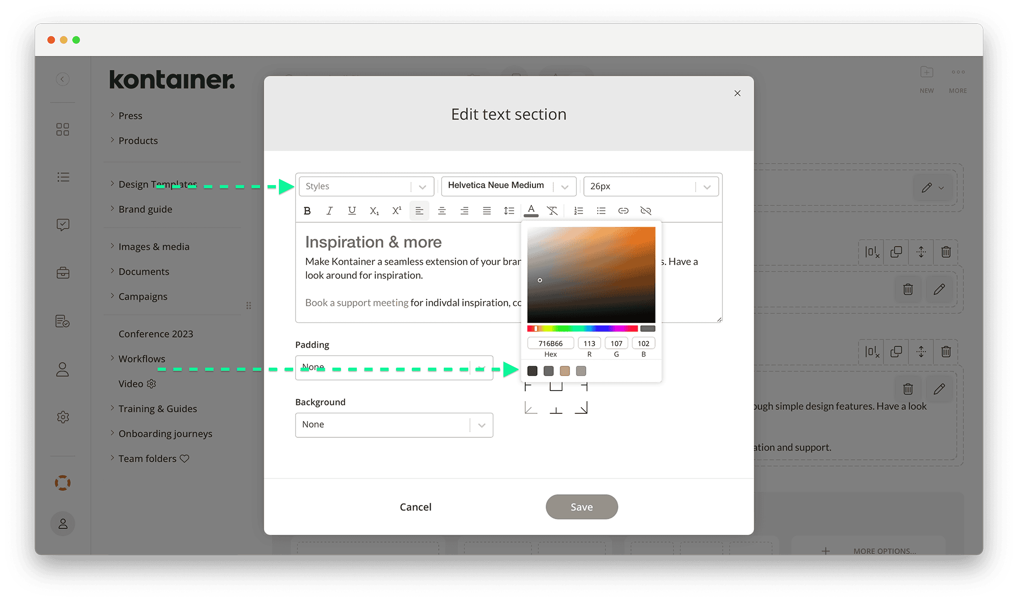
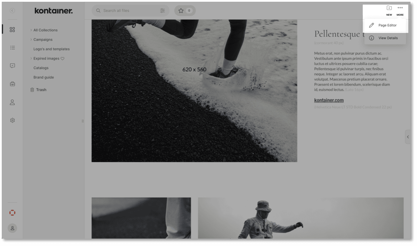
Access the Page Editor
The Page Editor is accessed inside your folder in the top right corner under the three-dotted More menu.
Here you can add new elements, edit and rearrange them. See the full Page Editor video here.
Crop Your Images
Set up download templates that match your content boxes to get images that slot straight into your page designs.
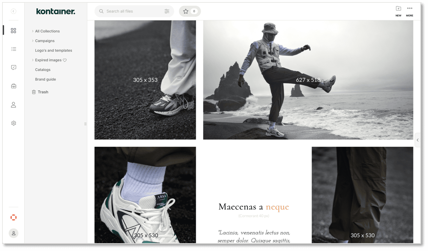
To see the complete guide to Download Templates here.
Page editor - Design inspiration
We have created just a few examples of what page stylings could look like.
Have a look and get some inspiration HERE.
BRAND SECTION
You can also add text to the bottom of the menu bar on the left.
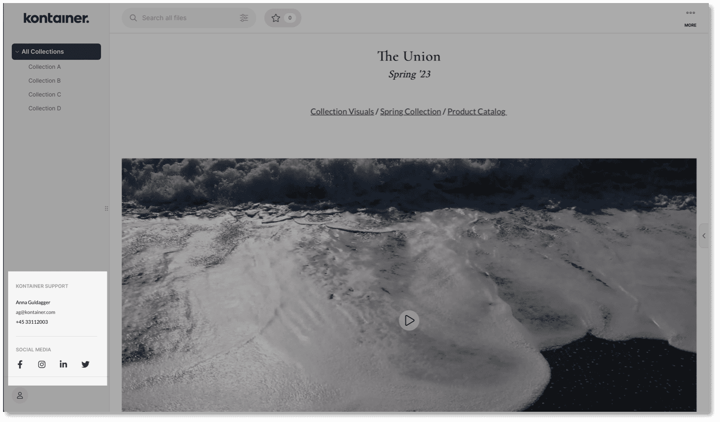
Here you can add sections with text, like contact details or a brand message.
You cannot see the section as an admin user, but you can activate it for all other user types and share links.
You can also add social media links and direct traffic from Kontainer to your channels.
Set Up Brand Section
To create a Brand Section, go to Settings – Brand Section. And just underneath, you can set and activate your social media links.
Check out our Brand Section guide here.
CASE: ROLL OUT A BRAND GUIDE
Use the customization features in Kontainer to make a brand guide that is easy to navigate, with pages that can be shared externally and others for internal use only.
Other uses could be a press kit or an event launch.
Folder Structure
First, make a Brand Guide folder and determine which subfolders you need.
Set up all the subfolders that could be relevant for you. Access can be differentiated internally and externally between teams, companies, etc. (See below)
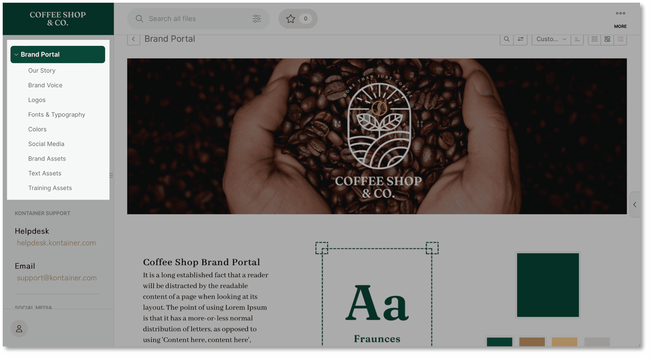
Your needs might differ from the example above, which serves as inspiration.
Design Brand Pages
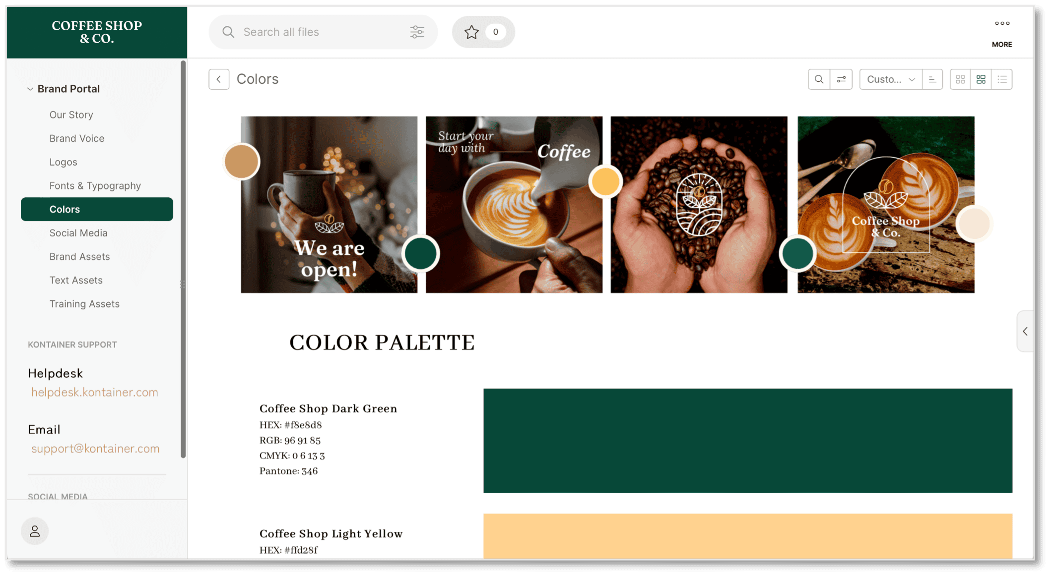
Once you have mapped the structure, you can start building your brand pages with text, images, video and gifs.
Go to a folder and find the Page Editor under the three-dotted More menu in the top right corner.
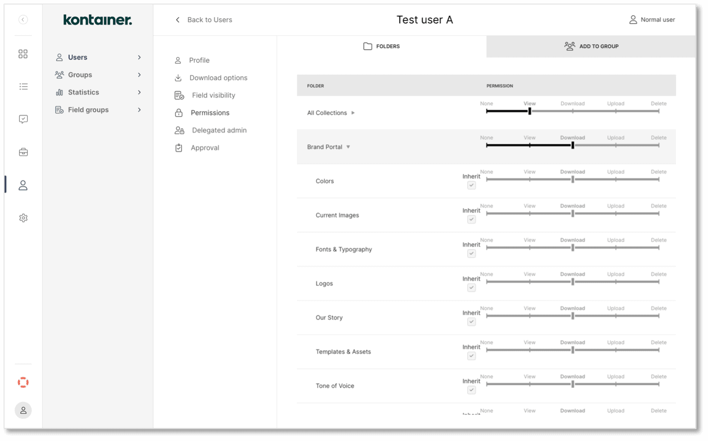
Manage Access
Set permissions by user or user group in the Access menu.
–––
That was it; our short styling guide.
We can't wait to see how you will customize your Kontainer!